Case Study: Web Platform + Admin Dashboard + Integration Hub
Lehigh Valley Health Network
A new platform, simplified user experience, and design system that gives users clear choices, pathways, and actions to access care.

The Lehigh Valley Health Network web platform layers thousands of pieces of data and a complex web of technical integrations and requirement into a simple, streamlined user experience to give users what they actually want in accessing healthcare.
Challenge
Within a massive organization, including over 700 locations, nearly 3000 doctors, and 18,000 staff, reducing the content to create a simplified tool that gives users the simplest and clearest path to accessing healthcare required a compelling UX strategy that could resonate with layers of stakeholders. This challenge is paired with designing on top of a robust search interface that layers in multiple integrations that feels streamlined to users to reduce friction wherever possible.
Impact
+370% Increase in pageviews
+22% Increase in return visits
+10% Increase in fundraising
Role
Research
Design Lead
User Experience Design
Visual Design
Interaction Design
QA
ThinkShout Team
4 Strategists
20+ Developers
3 Producers
2 Designers
Key Features
Robust Solr Based Search
Integrations with Epic, Intellicred, Salesforce,
Live Chat
Flexible templates
Campaign theme with engagement
Map based results


Research
Building a Foundation
Our team flew to Pennsylvania several times to meet with stakeholders from across the organization and learn about their challenges and opportunities. Running collaborative workshops on site resulted in a competitive analysis and strategic recommendations.
Process
Competitive Analysis
Analytics
Surveys
Onsite workshop


Strategic
Recommendations
Focus on the needs of the customer by simplifying the information made available
Elevate and improve searching for doctors and locations
Streamline integration between LVHN.org and MyLVHN.org (epic)
Build brand equity and trust with a broader audience
Helping existing patients accomplish the tasks they need to perform online
Create a platform conducive to regular usability testing
Research + Audits
Mapping systems toward simplification
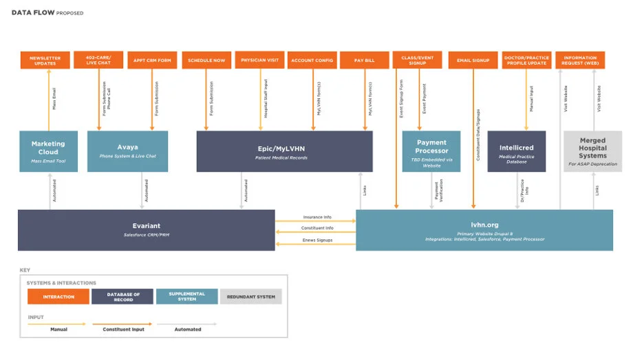
In order to plan out how to break down and rebuild, our team deconstructed every system, integration, piece of data and user behavior to map out a new site architecture. The data show that what people are looking for is consistent – to find a doctor, location or service quickly and easily.
Deliverables
Data Flows
Entity Relationships
Site Map with Comparative Analytics
Content Groupings
Content Audits


User Experience: Wireframes
Creating a UX Web to meet people where they are
Whether on a desktop or mobile device, the user experience for this site combines a simplified architecture, pared down content and clear actions that allows users to access information and perform tasks as frictionless as possible. With the principle that every page is a homepage, users should be able to find a doctor, location or service from any pathway they enter the site. This is achieved through a complex taxonomy structure that creates associations to dynamically relate relevant content. This, combined with a flexible block system, creates opportunity for every page on the site to provide clear information, contextual pathways, core actions and timely information.
Challenges
Transform thousands of piece of content and data into clean, simple results
Create a streamlined filtering experience based on structured data that feels meaningful to users
Translate organizational language and structures into user-focused structures
Cross-reference all information for a more organic searching experience

Creative Direction
A Streamlined brand for a long-term vision
Retaining the goal of simplification, we recommended a simplified approach leveraging only core brand elements. This minimal approach creates a consistent brand presence across their ecosystem, building trust with audiences, while giving the website a clean focused aesthetic to remain foundational as the brand evolves in the future outside the platform.
Approach
Convince stakeholders to align around a new approach
Maintain a simplified aesthetic while focusing on accessiblity
Create clear actions, branded moments and pathways toward related content
Creative Direction
Updated Color Palette
Streamlined Typography + New Iconography
Visual Design
Designing a Tool for Life’s Difficult Moments
Finding opportunities to connect with users on an emotional level while presenting a lot of information requires identifying small moments that connect with users. Understanding where users are coming from drives the vision for the visual design of this platform. Pairing small moments of personal or familiar imagery with consistent and friendly design patterns reduces friction to accessing healthcare while building brand trust.
Features
Flexible templates for emerging or urgent needs
Expanding or collapsable filtering features
Branding components for pathways to unique information about specialty care
Clear and consistent calls-to-action for a focus on interaction and transaction


Visual Design + UX + User Flow
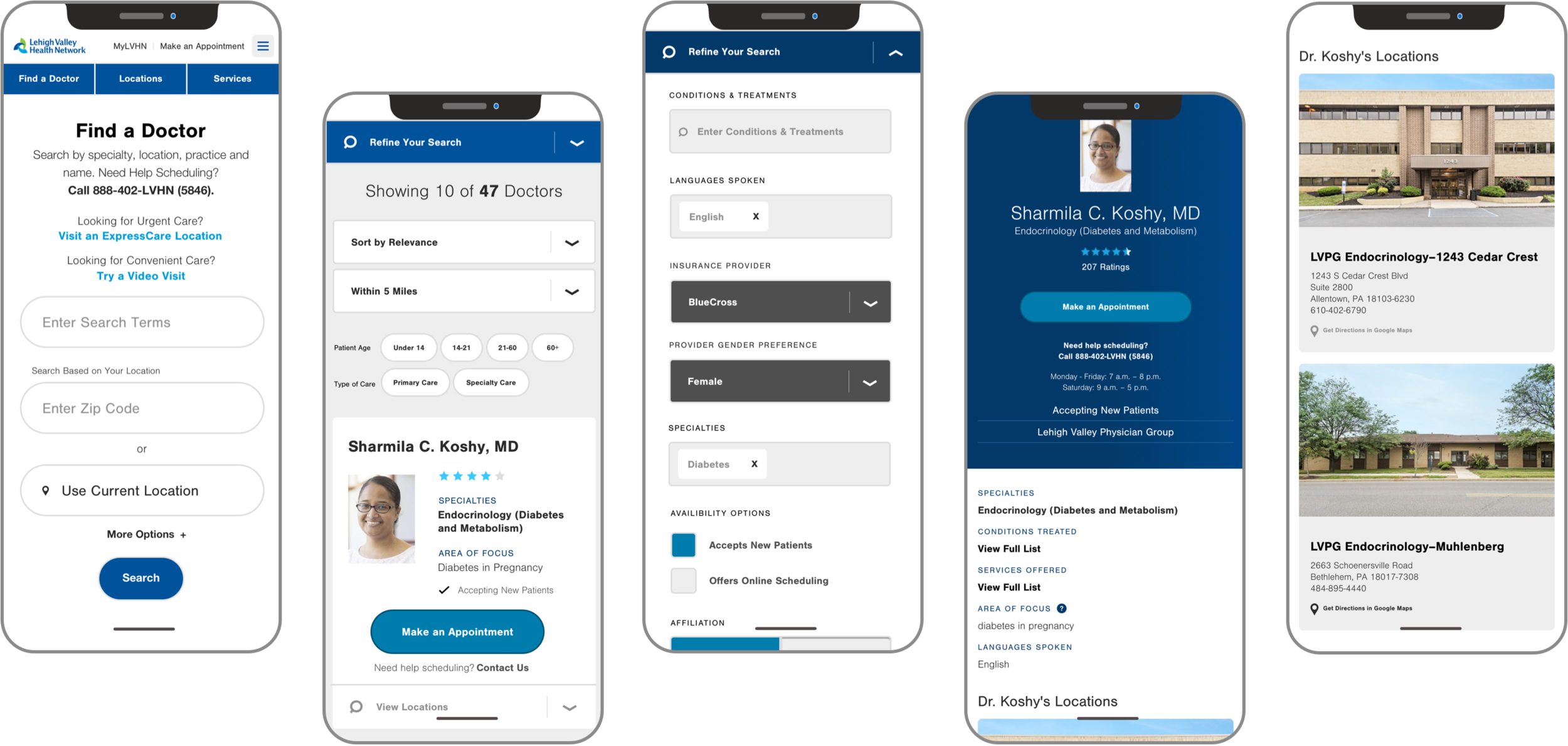
A complex search tool designed to feel simple and intuitive
This search, powered by Solr and funneled through the CMS, transforms a complex data structure, structured content and database into a clean streamlined experience that users can easily filter to their exact needs. Our research showed that most visitors landed deep in the site after a search. Whether starting with finding a doctor, location, service or treatment type, users can access all related care through the pathway they chose to enter.
Visual Design
Designing for Integrations
With over 18,000 employees and 722 locations, the LVHN web platform relies on a complex network of third-party providers. These integrations and APIs, some specific to the healthcare industry, pull in real-time, structured data and related information. Designing for these endpoints means always asking questions and letting constraints be an opportunity to get creative.
Features + Integrations
Solr based search with weighted results
Auto complete filters with user-centered language layered on medical taxonomy terms
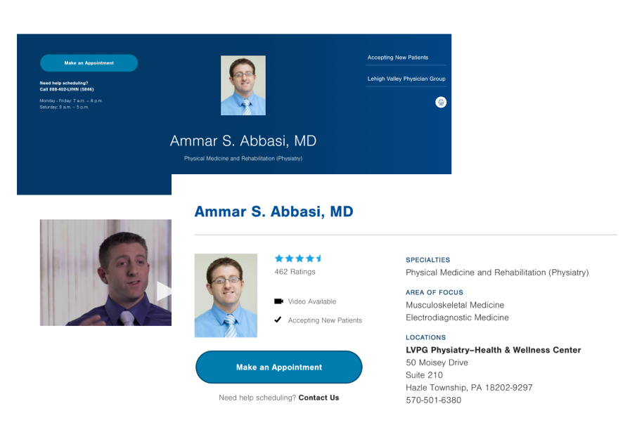
Dynamic ratings and reviews powered by NRI
Dr. Profiles powered by Intellicred
Wait times and Appointment Modals powered by Epic
LiveChat Module
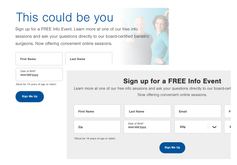
Salesforce Pardot: Campaign lead form integration
Epic: Direct pathways off platform to make appointments
Epic: ExpressCare Modals and Wait times to reserve a spot
Intellicred: Official database of record for provider information
NRI: Javascript Integration for doctor ratings and reviews
Yext: Modals for Surveys
Visual Design
A Design System for Evolving Needs
Starting discovery during summer 2017 and launching in early 2019, the LVHN platform has continued to grow and evolve as new needs emerge. In creating a streamlined design system that serves as a foundation for this robust platform, the integrity of the site design and structures can remain intact even as more discovery continues into 2021.

Usability Testing + Stakeholder Management
Ensuring success through testing + creating stakeholder alignment
While developing this robust design system, we created a testing plan, ran usability testing and brought stakeholders along with our vision so there were no surprises after investing thousands of hours into the new platform.
Deliverables
User testing goals, plan and measurements
User testing design stategy
User testing prototypes
Design strategy presentations targeted toward specific executive stakeholders


Admin Dashboard User Experience
Good UX starts with content creation
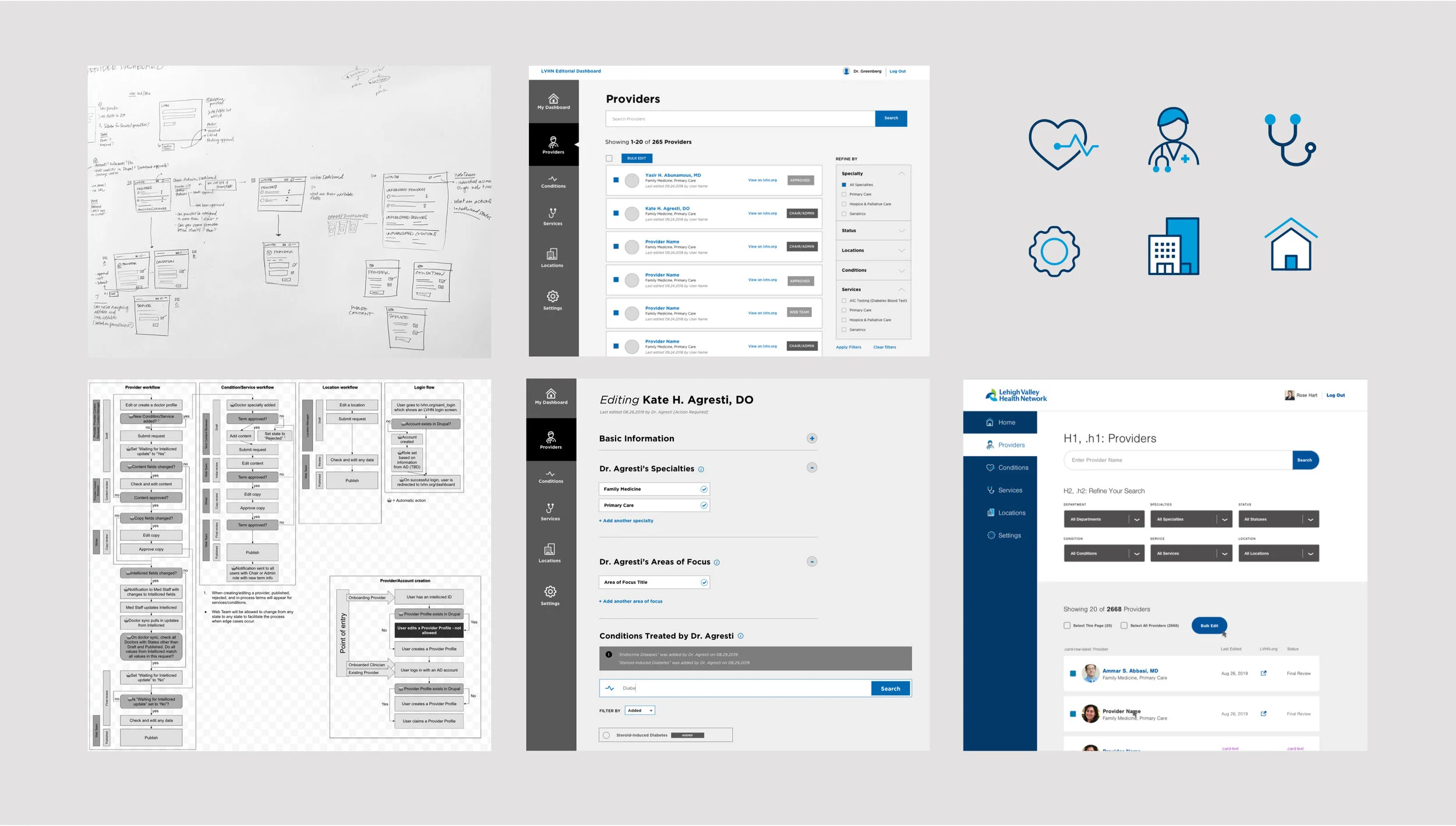
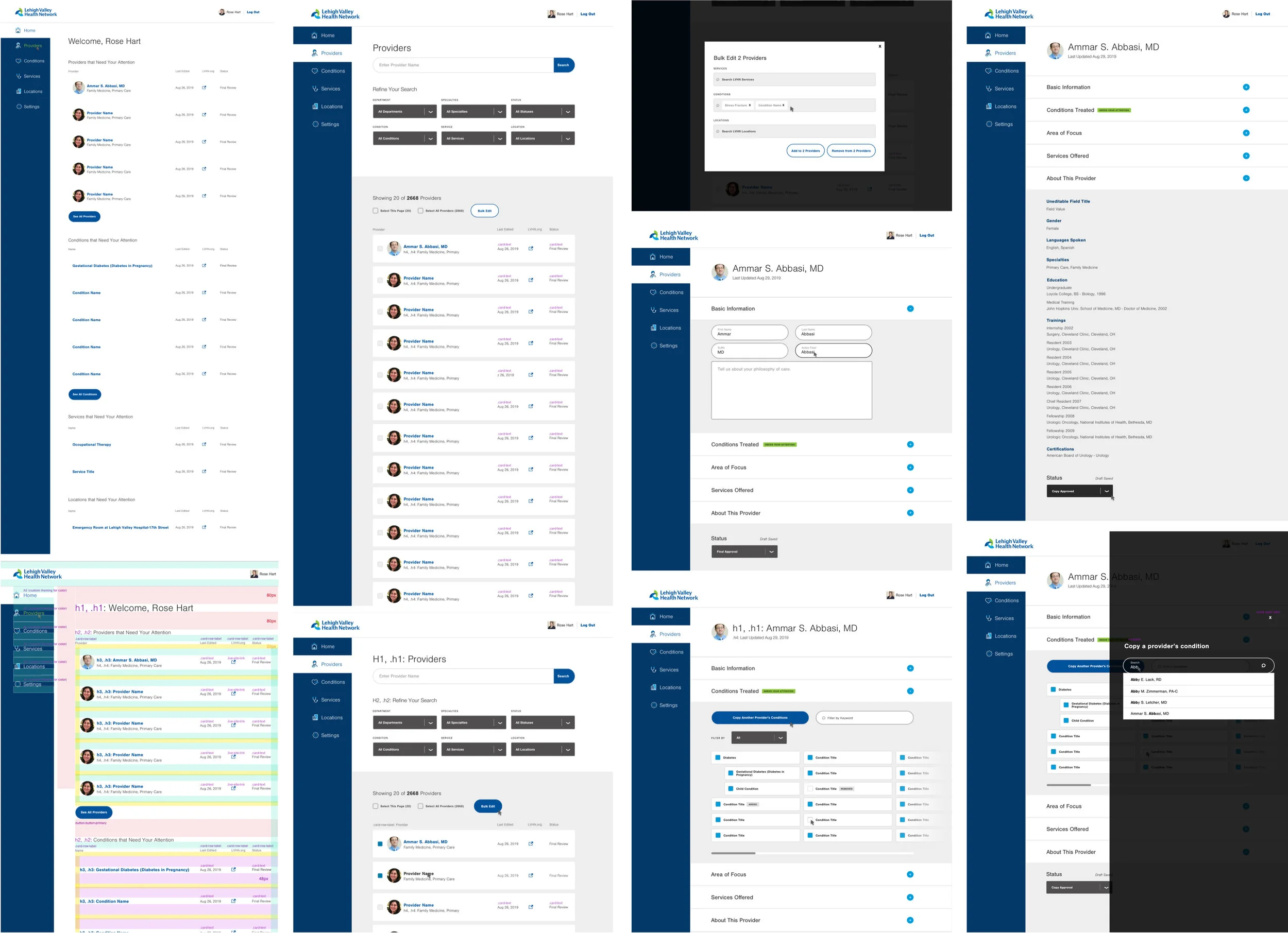
Creating a tool for the public is only as good as the content that feeds it. We designed the provider dashboard to make creating, vetting and publishing content more intuitive and for internal admins.
Process
Research
User Stories
Wireframes
Visual Design
Iconography
Continued Discovery
Evolving a Product
Through 2020-2021, we are revisiting discovery and running virtual workshops with a variety of stakeholders. We are rethinking strategy; evaluating analytics, user behaviors, content xx design, to make LVHN work better for emerging user and organizational needs during the pandemic. Over the course of the year, LVHN.org will reflect the new world of healthcare.


